Uses
Cards are used as a way to display content in an organized and consistent manner across a site. The use of cards give the user a visual cue about what type of information they are about to read. On the School of Medicine, cards are used primarily for news items. A featured image is displayed, followed by the date, title, description, and tag (or category) of that particular article.
Styles
Cards are rectangle shaped with slightly rounded corners and a drop shadow. The images used have a 3:2 aspect ratio. The next element is the article publication date, which is always in all caps with the color of #838383. The title is an h2 which links to the article, followed by the description (p tag). Finally the category mimicks the same style as the article publication date.
Cards can be a variety of sizes, but typically cover either 4 columns (one third of the page), 8 columns (two-thirds of the page) or all 12 columns (full-width page). For a card that covers 12 columns, the featured image will cover 8 columns, while the content covers the final 4 columns.
Examples
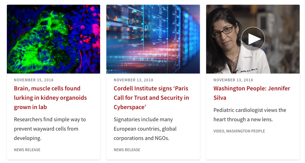
The above is an example found on the News page on the School of Medicine site. This style represents a row of three 4-column cards. The example on the far right shows a video news article. While the video thumbnail is placed on the featured image thumbnail, the video will not directly play within the card. This will take the user to the news article where the video will display.
Code
HTML
<div class="news-cards">
<ul class="clearfix">
<li>
<div>
<a href="https://medicine.wustl.edu/news/brain-muscle-cells-found-lurking-in-kidney-organoids-grown-in-lab/">
<div class="card" style="height: 497px;">
<img width="600" height="441" src="https://medicine.wustl.edu/wp-content/uploads/KidneyOrganoid-600x441.jpg">
<div class="card-text">
<p class="article-date">November 15, 2018</p>
<h2 class="article-title">Brain, muscle cells found lurking in kidney organoids grown in lab</h2>
<p>Researchers find simple way to prevent wayward cells from developing.</p>
<p class="news-source">News Release</p>
</div>
</div>
</a>
</div>
</li>
</ul>
</div>
CSS
.news-cards {
background: transparent;
width: 88%;
max-width: 940px;
margin: 0 auto;
}
.news-type-title {
max-width: 940px;
width: 88%;
margin: 0 auto 15px;
}
.news-type-title p {
border-radius: 2px;
font-weight: 600;
font-size: 18px;
display: inline-block;
margin: 0!important;
}
.news-cards ul {
font-size: 0;
list-style: none;
margin: 0 -10px;
}
.news-cards li {
width: 33.3333%;
display: inline-block;
vertical-align: top;
margin: 0 0 5px;
}
.news-cards li > div {
margin: 10px;
}
.news-cards li div.card {
position: relative;
border-radius: 3px;
background: #fff;
overflow: hidden;
-webkit-font-smoothing: antialiased;
box-shadow: 0 2px 5px 0 rgba( 0,0,0,0.13 );
-webkit-transition: box-shadow 0.2s, transform 0.2s;
transition: box-shadow 0.2s, transform 0.2s;
}
.news-cards li > div > a {
display: block;
}
.news-cards li.headshot div.card:before {
content: '';
height: 195px;
width: 100%;
position: absolute;
top: 0;
left: 0;
z-index: 0;
border-top-right-radius: 3px;
border-top-left-radius: 3px;
background: #f9f9f9;
}
.news-cards li div.card:hover {
box-shadow: 0 3px 6px 0 rgba( 0,0,0,0.20 );
transform: translateY( -2px );
}
.news-cards .video-card-image,
.editors-pick .video-card-image {
position: relative;
}
.editors-pick .video-card-image {
float:left;
width: 66%;
}
.news-cards li img {
width: 100%;
height: auto;
display: block;
}
.news-cards li.headshot img {
height: 200px;
padding: 21px 0 0 20px;
z-index: 2;
width: auto;
position: relative;
}
.editors-pick .video-card-image {
float: left;
width: 66%;
}
.news-cards li img.video-play-icon,
.editors-pick img.video-play-icon {
width: 80px;
display: inline-block;
position: absolute;
top: 50%;
left: 50%;
margin: -40px 0 0 -40px;
}
.news-cards .card-text {
position: relative;
padding: 10px 23px 24px;
}
.news-cards .has-audio {
width: 19px;
position: absolute;
top: 8px;
right: 8px;
}
.news-cards .article-title {
display: block;
margin-bottom: 10px;
line-height: 1.5;
}
.news-cards li h2 {
font-size: 20px;
font-weight: 600;
margin: 0;
}
.news-cards p {
margin: 0;
color: #333;
line-height: 1.7;
font-size: 18px;
}
.generic-cards .article-date,
.news-cards .article-date {
text-transform: uppercase;
color: #838383;
font-weight: 600;
font-size: 13px;
letter-spacing: 0.9px;
}
.generic-cards .news-source,
.news-cards .news-source, .ep-card .news-source {
text-transform: uppercase;
color: #838383;
font-weight: 600;
font-size: 13px;
line-height: 1.3;
margin-top: 15px;
}