Screens
The School of Medicine site is designed for all different types of screen sizes. The site is coded using CSS breakpoints which allows customized layouts designed for incremental screen sizes.
Desktop Screen Sizes
The home page has no maximum width defined, however for certain sections at a larger screen size, a margin is introduced which increases as the browser size increases. For subpages on the site, the maximum width defined is 960 pixels for body content.
A two column layout is used for all interior pages on desktop screens.
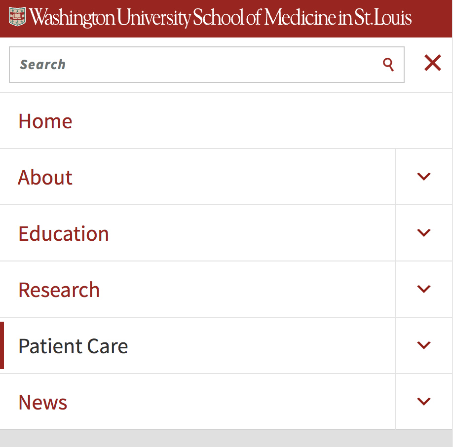
Navigation
Navigation Element 1
Navigation Element 2
Navigation Element 3
Navigation Element 4
Navigation Element 5
Navigation Element 6
Body Content
Heading
Lorem ipsum dolor sit amet, consectetur adipiscing elit, sed do eiusmod tempor incididunt ut labore et dolore magna aliqua. Ut enim ad minim veniam, quis nostrud exercitation ullamco laboris nisi ut aliquip ex ea commodo consequat. Duis aute irure dolor in reprehenderit in voluptate velit esse cillum dolore eu fugiat nulla pariatur. Excepteur sint occaecat cupidatat non proident, sunt in culpa qui officia deserunt mollit anim id est laborum.
The left column is used for navigation which has a fixed width of 195 pixels with a 20 pixels right margin totaling to 215 pixels. The right column is used for content which has a fixed width of 645 pixels with 50 pixels of left and right padding which totals to 745 pixels.

Mobile Screen Sizes
For mobile screens, all the navigation and content moves to 1-column.
A hamburger menu is used for navigation. When the user clicks on this icon, the navigation appears on screen. With this approach, the navigation and body content are not on the screen at the same time.