Grid Systems
To create visual harmony and aid in responsive design, grid systems are typically employed for the design of our pages. Usually, a 12 bar grid system is used with a gutter. The gutter width represents the space between each bar.

A 12 bar grid system with 5 pixels gutter.

A 12 bar grid system with 20 pixels gutter and a 20 pixelmargin on each side.
Examples
For the School of Medicine site, the use of grid systems vary based off of the design needs of the page. In the examples below, you can see how the overall approach stays the same, whereas the layout changes depending on the need.
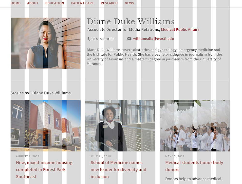
A 12 bar grid system in which the content is divided into thirds with a gutter. The top section's featured image takes up one-third of the grid, while its accompanying content beside it take up two-thirds
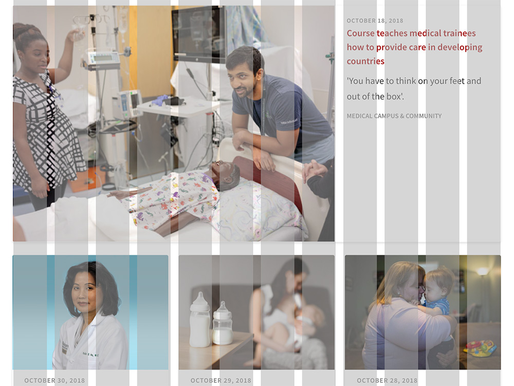
A 12 bar grid system in which the content is divided into thirds with a gutter. The top section's featured image takes up two-third of the grid, while its accompanying content beside it take up one-third.